Build a Stopwatch app with SwiftUI
Learn how to build a Stopwatch app with SwiftUI. In this tutorial you will learn how to use the SwiftUI and Combine framework to build a Stopwatch App.
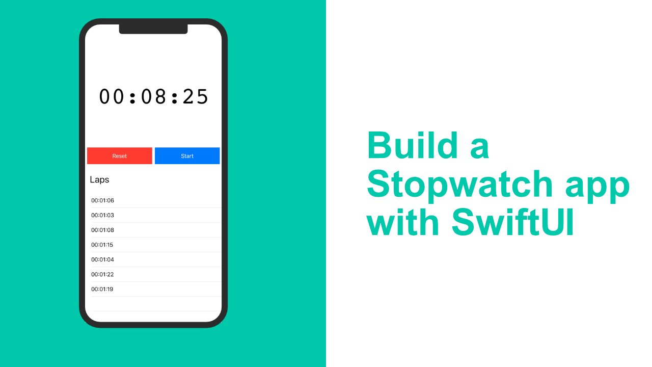
In this post I will show you how to build a stopwatch app using SwiftUI. In this post I will show you how to create custom views using SwiftUI as well as some basic layout and using "ObjectBinding".
I know we are building a stopwatch app, but I am not going to go through the actual StopWatch code logic as I feel that is out of scope for this tutorial. This tutorial is more about building the apps UI with SwiftUI.
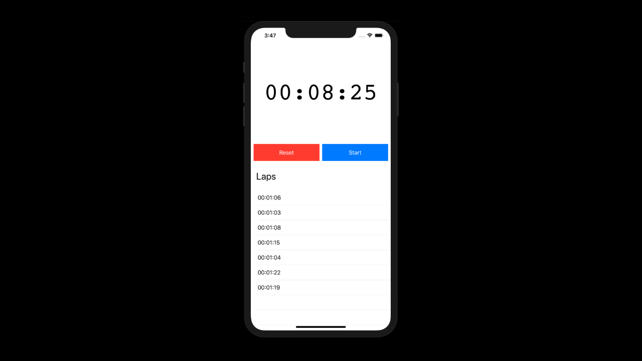
In the above picture you can see what the app will look like when we are done. It is nothing special, but it is functional.
When the app is complete, you will be able to start the stop watch, record laps times(this will only be in memory), pause the stop watch and reset it.
So now that we know what it needs to look like and what the functionality is, we can start building it.
Step 1: Add the StopWatch class to your project
I created this class for this tutorial only. I would not classify it as production ready as it has not been tested properly, the code is also not too great. It is for demonstration purposes only.
You can find the StopWatch class here, or you can download the entire project here.
Step 2: Add the timer Text()
In your main ContentView inside the body variable we need to add a VStack. Your code should look like this:
struct ContentView : View {
    @ObservedObject var stopWatch = StopWatch()

    var body: some View {
        VStack {
       	    // Code here
        }
    }
}
That VStack will hold all of our UI. Now that we have our VStack we can add in our Text view to display the timer text.
With SwiftUI the parent view cannot force a size on the child/children view, so we will need to do most of the styling on the Text view that we add. Add the following code inside the VStack that we added in just now.
Text(self.stopWatch.stopWatchTime)
    .font(.custom("courier", size: 70))
    .frame(width: UIScreen.main.bounds.size.width,
           height: 300,
           alignment: .center)
In the above code we are creating a new Text view. We set the default text to be 00:00:00 which will be updated later on with the proper value.
After that we start with the styling. I changed the font to courier, this works better as it is a monospace font, when I used the standard system font the text would shake because it was changing all the time. We also set the size to be 70 so that it is nice and big. The next thing we do is update the frame. We want the width to be the full width of the screen but we also want it to be quite tall, so we set the height to 300. Technically you can leave the .center alignment out as that is the default setting.
Your app should now look like this:
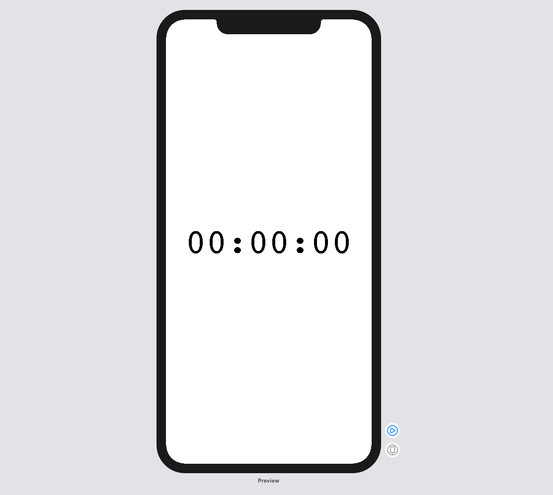
Not exactly what we want, but it is a start.
Step 3: Create the buttons view
Before we carry on with the layout, we need to create the buttons. This will be a new custom view. The buttons functionality as well as text will change depending on the state of the stopwatch.
For example, when the timer is stopped, we will have two buttons, one will be to reset the timer and the other will be to start the timer. If the timer is busy timing, those buttons will change to a lap button and a pause button.
Because the app is super small, I have put the logic in the button. If the app was bigger, I would strip out the logic from the button and use something else to create the button that I need based on the parameters I pass to it.
What do the buttons require?
Each button needs to take in two actions and two strings. They also need to have a color and they need to know if the timer is paused or not.
The code
To do this, create a new struct called StopWatchButton and have it conform to the View protocol as below:
struct StopWatchButton : View {
    var body: some View {
        // Buttons coming soon
    }
}
We can now add in the properties just above the body property.
Change your struct to look like this now:
struct StopWatchButton : View {
    var actions: [() -> Void]
    var labels: [String]
    var color: Color
    var isPaused: Bool

    var body: some View {
        // Buttons coming soon
    }
}
Great, we can now add the button logic in the body.
The first thing that we need to add is a button width variable in the body. This value is quite random, but it works for our needs.
Your body property should now look like this:
var body: some View {
    let buttonWidth = (UIScreen.main.bounds.size.width / 2) - 12
}
This will give an error but don't worry, we will sort that out now.
We will now create the button view. It is not too complicated. A basic Button in SwiftUI takes two arguments, one is the action and the other is the label view. In our action and label parameters we will check if the timer is paused and based on that we will know what function to call and what Text view we need to display.
Update your body variable to look like the below:
var body: some View {
    let buttonWidth = (UIScreen.main.bounds.size.width / 2) - 12

    return Button(action: {
            if self.isPaused {
                self.actions[0]()
            } else {
                self.actions[1]()
            }
        }) {
            if isPaused {
                Text(self.labels[0])
                    .foregroundColor(Color.white)
                    .frame(width: buttonWidth,
                           height: 50)
            } else {
                Text(self.labels[1])
                    .foregroundColor(Color.white)
                    .frame(width: buttonWidth,
                           height: 50)
            }
        }
        .background(self.color)
    }
}
In the above code you can see what we are doing. In the action section(the first closure) we check the isPaused property. If it is true then we use the first action in our actions array, otherwise we use the second action.
The same is true for the label. If isPaused is true, we will use the first string from our labels array, otherwise we use the second string.
Other than that, each Text view has the same styling, we could create our own custom text view for that, but this is pretty simple so I don't see much of a need for that right now. If we were going to use text views that were the same as these elsewhere then I would definitely create a custom text view.
One thing to note is how the Text view frame is being set and not the buttons frame. As I mentioned earlier, SwiftUI requires us to set the frame on the child view as the parent cannot tell the child what to do.
The last thing that we do is we set the background color for the button.
The final code for the StopWatchButton should look like this:
struct StopWatchButton : View {
    var actions: [() -> Void]
    var labels: [String]
    var color: Color
    var isPaused: Bool

    var body: some View {
        let buttonWidth = (UIScreen.main.bounds.size.width / 2) - 12

        return Button(action: {
            if self.isPaused {
                self.actions[0]()
            } else {
                self.actions[1]()
            }
        }) {
            if isPaused {
                Text(self.labels[0])
                    .foregroundColor(Color.white)
                    .frame(width: buttonWidth,
                           height: 50)
            } else {
                Text(self.labels[1])
                    .foregroundColor(Color.white)
                    .frame(width: buttonWidth,
                           height: 50)
            }
        }
        .background(self.color)
    }
}
Step 4: Adding the buttons
Ok, most of the complicated stuff is now out of our way and we can get back to laying out our UI.
The next thing that we need to do is to add the two instances of our new StopWatchButton. Before we do that we need to create an HStack that can wrap our buttons.
Update your ContentView struct to look like the below:
struct ContentView : View {
    @ObjectBinding var stopWatch = StopWatch()

    var body: some View {
        VStack {
            Text(self.stopWatch.stopWatchTime)
                .font(.custom("courier", size: 70))
                .frame(width: UIScreen.main.bounds.size.width,
                       height: 300,
                       alignment: .center)

            HStack{
                // Our buttons will go here
            }
        }
     }
 }
As you can see. Nothing much has changed except that we now have an HStack below our Text view that will display the current timers string value.
Inside that HStack you need to add the following code:
StopWatchButton(actions: [self.stopWatch.reset, self.stopWatch.lap],
                labels: ["Reset", "Lap"],
                color: Color.red,
                isPaused: self.stopWatch.isPaused())

StopWatchButton(actions: [self.stopWatch.start, self.stopWatch.pause],
                labels: ["Start", "Pause"],
                color: Color.blue,
                isPaused: self.stopWatch.isPaused())
After adding that code, your app should look like this:
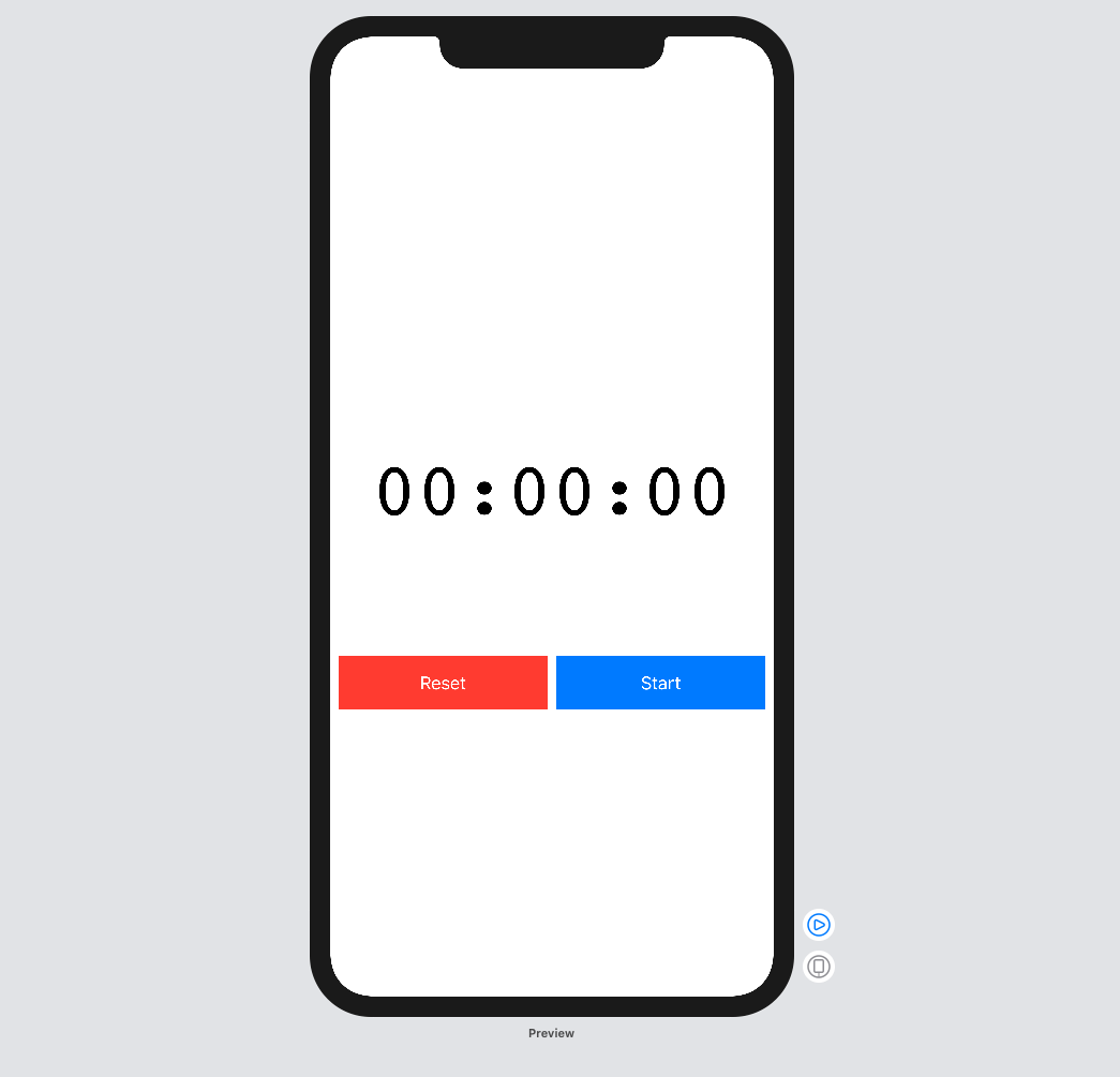
This might be a bit confusing. In the above code we are creating two new instances of our StopWatchButton.
As discussed earlier these buttons have four properties. The first property will be the functions that we want to call depending on the isPaused state. The first button that we create will be our Reset/Lap and our second button will be our Start/Pause button. In the image you cannot see the Lap button and the Pause button, but if you run the app and click on the Start button, you will be able to see the Lap and Pause button. Please note, if you run the app and you tap on the Lap button, nothing will happen visually. The code will be working correctly, but in the next step I will show you how to get the lap times to show up in the list.
Step 5: Displaying the lap times
This next part is pretty simple. All we have is a VStack that wraps around a Text view and a List view.
Below the HStack that we created in the previous step, add the following code:
VStack(alignment: .leading) {
    Text("Laps")
        .font(.title)
        .padding()

    List {
        ForEach(self.stopWatch.laps, id: \.uuid) { (lapItem) in
            Text(lapItem.stringTime)
        }
    }
}
Now that you have added that, your app should look something like this:
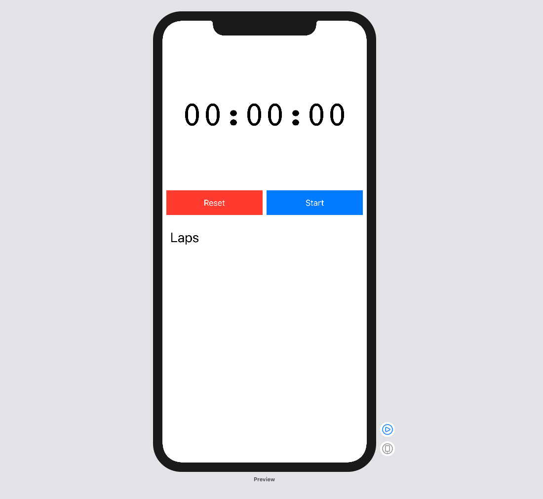
Please note that these screen shots are being taken in Xcode, if you run the app, you will see the cells of the List.
Ok, so what is happening in that code. The first thing that is different is that the VStack is taking an argument for alignment. The reason that I have done this is because if we remove it, the Laps text view will be centered on the screen, and I preferred it to be on the left hand side.
Inside the VStack we add a Text view. We set the font size to be of .title size, has it is a section heading in our app. We also add padding to the Text view. This gives it a nice amount of spacing so that it is separated from the buttons above.
The final part is to add the List view. List views require a unique identifier for each cell. Unfortunately, each lapItem would not have a uniquely identifying property, so I had to add a uuid property which gets used in the ForEach. We then have access to the lapItem. We can now add in another Text view in which we can display each of the lap times that we have stored. To do this we simply access the stringTime property on the lapTime object that we have, and pass that to the Text view.
If you build and run the app now, you should be able to start the stopwatch, tap the Lap button and see the lap times show up in the bottom List. You should also be able to tap the Pause button and have the stopwatch pause, and once it is paused you should be able to tap the Reset button which will reset the stopwatch time as well as remove all the lap times from the List.
This is what the final code looks like:
import SwiftUI
import Combine

struct StopWatchButton : View {
    var actions: [() -> Void]
    var labels: [String]
    var color: Color
    var isPaused: Bool

    var body: some View {
        let buttonWidth = (UIScreen.main.bounds.size.width / 2) - 12

        return Button(action: {
            if self.isPaused {
                self.actions[0]()
            } else {
                self.actions[1]()
            }
        }) {
            if isPaused {
                Text(self.labels[0])
                    .foregroundColor(Color.white)
                    .frame(width: buttonWidth,
                           height: 50)
            } else {
                Text(self.labels[1])
                    .foregroundColor(Color.white)
                    .frame(width: buttonWidth,
                           height: 50)
            }
        }
        .background(self.color)
    }
}

struct ContentView : View {
    @ObservedObject var stopWatch = StopWatch()

    var body: some View {
        VStack {
            Text(self.stopWatch.stopWatchTime)
                .font(.custom("courier", size: 70))
                .frame(width: UIScreen.main.bounds.size.width,
                       height: 300,
                       alignment: .center)

            HStack{
                StopWatchButton(actions: [self.stopWatch.reset, self.stopWatch.lap],
                                labels: ["Reset", "Lap"],
                                color: Color.red,
                                isPaused: self.stopWatch.isPaused())

                StopWatchButton(actions: [self.stopWatch.start, self.stopWatch.pause],
                                labels: ["Start", "Pause"],
                                color: Color.blue,
                                isPaused: self.stopWatch.isPaused())
            }

            VStack(alignment: .leading) {
                Text("Laps")
                    .font(.title)
                    .padding()

                List {
                    ForEach(self.stopWatch.laps, id: \.uuid) { (lapItem) in
                        Text(lapItem.stringTime)
                    }
                }
            }
        }
    }
}

struct ContentView_Previews: PreviewProvider {
    static var previews: some View {
        ContentView()
    }
}
If you liked this post please share it and subscribe to my youtube channel.
You can find the source code here.
