Create and Customize a Button with SwiftUI

A Button is one of the most used views in any kinda of mobile application. In today's tutorial we will learn how to create and customize a Button using SwiftUI.
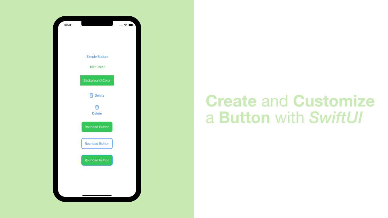
In this tutorial we will create 7 buttons, each with different styling. These 7 buttons will cover a lot of what is generally needed when we need to create a custom button.
Simple default button in SwiftUI
It goes without saying that a default button is the easiest button to make, so let's just dive straight into the code.
I have updated my body var to look like this:
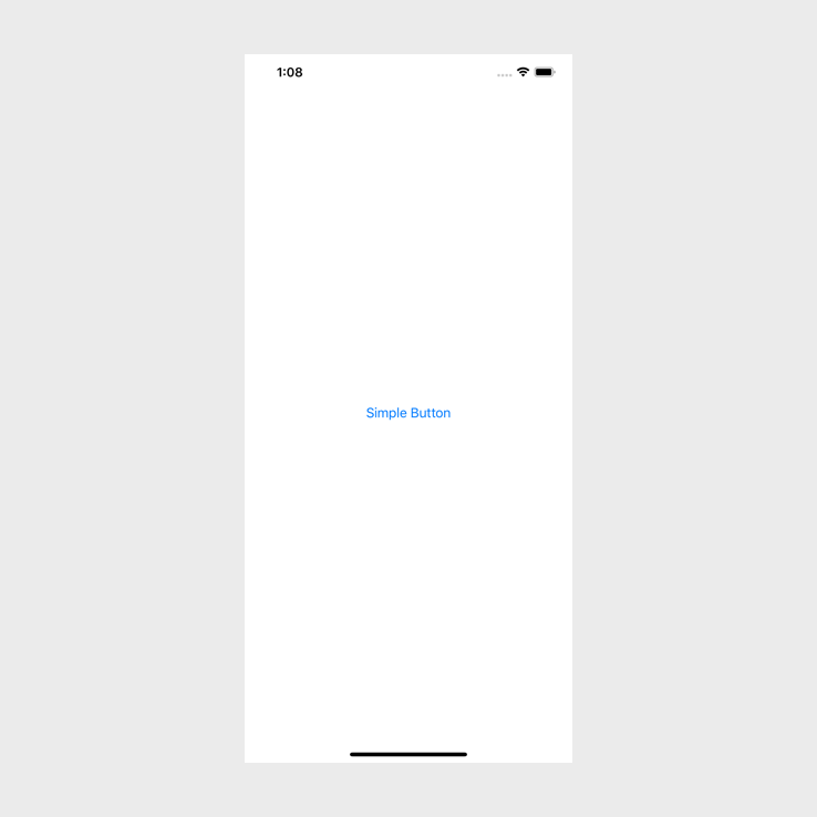
var body: some View {
    Button(action: {
        print("Simple Button")
    }, label: {
        Text("Simple Button")
    })
}
A Button takes two arguments. The first argument will be a closure that you want to run whenever the user taps on the button, and the second argument is a view. In this case we only want to show some text so we use a Text view with Simple Button as the string that we want to display.
If you build and run the app it should look like this:
Change button text color in SwiftUI
To change a button's text color in SwiftUI we need to use .foregroundColor on our text view.
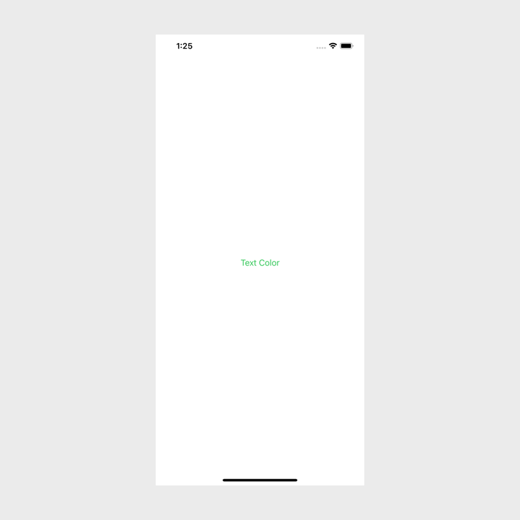
I am going to replace the previous body variable with the following:
var body: some View {
    Button(action: {
        print("Text Color")
    }, label: {
        Text("Text Color")
            .foregroundColor(Color.green)
    })
}
In the above code it is almost the same as the simple button, but we used a modifier to change the foregroundColor to green. This needs to be on the Text and not on the Button view.
If you build and run the app you should see the following:
Change background color of button with SwiftUI
Changing the background color of a button using SwiftUI is almost the same as changing the foreground color. In this example we will be using some padding to make the button look a little bit better, and that will also show us that when styling views in SwiftUI we need to pay attention to the order of the modifiers that we use.
This is going to be a little bit different to the previous parts of the article. Instead of providing all the code up front, I will provide the most basic button implementation and then go through the styling one modifier at a time.
I have updated my body variable to look like this:
var body: some View {
    Button(action: {
        print("Background Color")
    }, label: {
        Text("Background Color")
    })
}
If we build and run this it will look the same as the simple button that we done in the first section of this tutorial.
Let's add the background color to our button. To do this we need to add a backgroundColor modifier to our Text view like this:
var body: some View {
    Button(action: {
        print("Background Color")
    }, label: {
        Text("Background Color")
            .background(Color.green)
    })
}
In the above code I have added a background color of green. If you build and run the above code you will see the following:
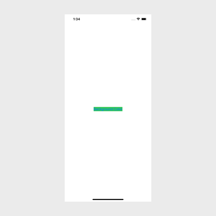
The background color has changed, but the text is almost unreadable, and the background color has no padding. To fix that let's update our text color.
To update the text color we will use the foregroundColor modifier method that we used in the previous section:
var body: some View {
    Button(action: {
        print("Background Color")
    }, label: {
        Text("Background Color")
            .background(Color.green)
            .foregroundColor(Color.white)
    })
}
If you build and run the app now you will see that the text is white:
But the button still looks unpleasant. The quickest way to make it look better is to add padding to our text. To do this all we need to use is the padding modifier like this:
var body: some View {
Button(action: {
print("Background Color")
}, label: {
Text("Background Color")
.background(Color.green)
.foregroundColor(Color.white)
.padding()
})
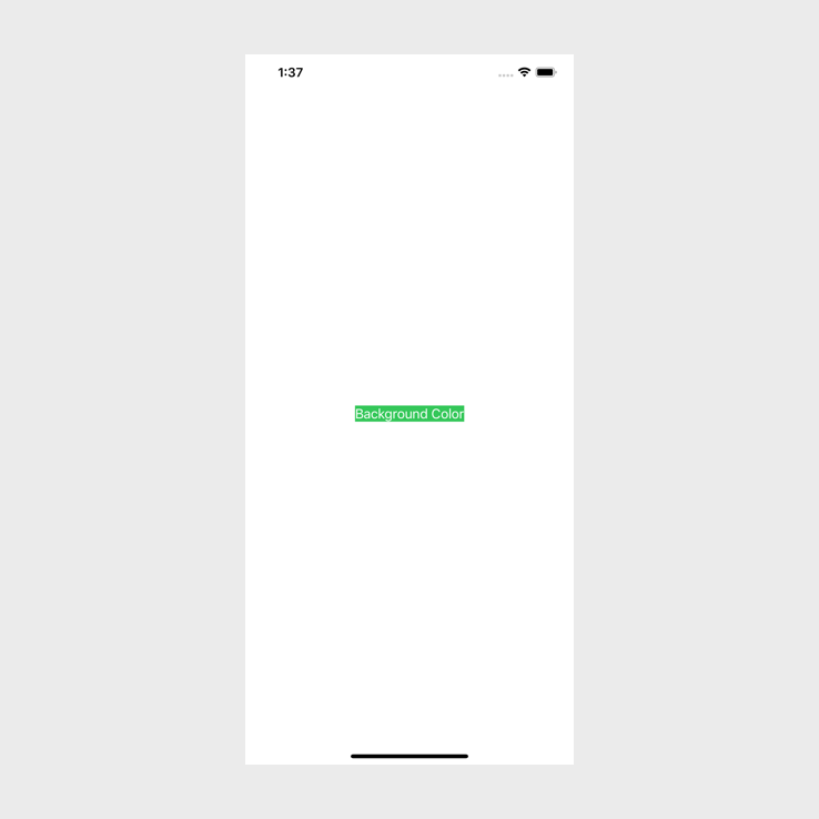
}But there is an issue if we do this, let's take a look at the problem. If you run the app now it will look like this:

Nothing will have changed. This is because the order of the modifiers matter. Let's change the order of the modifiers to the following:
var body: some View {
    Button(action: {
        print("Background Color")
    }, label: {
        Text("Background Color")
            .padding()
            .background(Color.green)
            .foregroundColor(Color.white)
    })
}
The only thing that we changed in the above code was putting the .padding() above the .background(). If we build and run the code now, we will see the following:
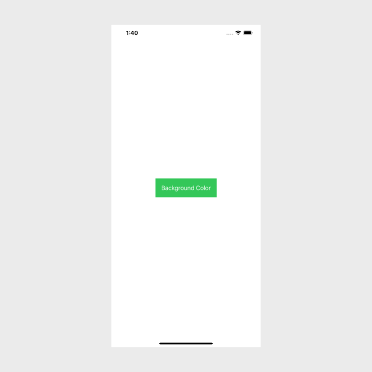
This looks much better and it teaches us that when we are using modifiers in SwiftUI we need to ensure of the order. The order is logical but it can still catch us out every now and then.
Create a button with an image using SwiftUI
In this part of the tutorial we are going to look at how we can create a button with an image that will be alongside the text. In the next part we will look at how we can put the image above the text.
Image next to text
Replace the body variable with the following:
var body: some View {
    Button(action: {
        print("Delete button")
    }, label: {
        HStack {
            Image("trashIcon")
            Text("Delete")
        }
    })
}
In the beginning of this tutorial I mentioned that the second argument for Button is a view. In this example we start to see how powerful this is. Instead of passing in a Text view, we are passing through an HStack that we can use to wrap our Image and Text view.
This will allow us to put our image next to the text. If you build and run your code you should see the following(if you are using the same image as me, you can find the image here):
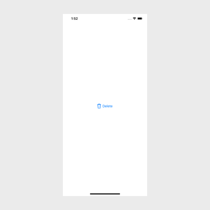
Image above text
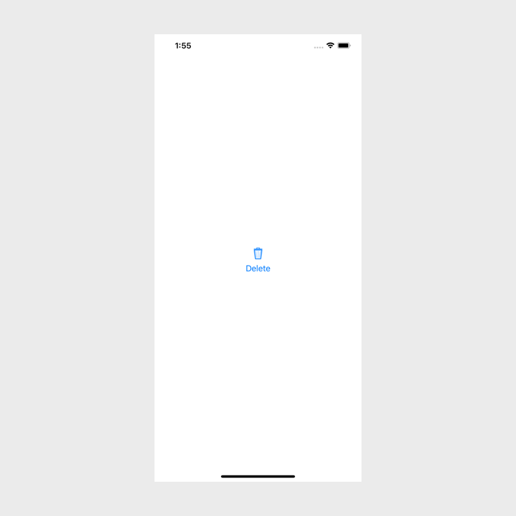
Now that we have seen how to add an image to a button horizontally, let's add our image above the text on our button.
To do this we only need to change one character. Instead of using an HStack we need to use a VStack. This is what my code looks like now:
var body: some View {
    Button(action: {
        print("Delete button")
    }, label: {
        VStack {
            Image("trashIcon")
            Text("Delete")
        }
    })
}
If you build and run the app it should look like this:
Create a button with rounded corners with SwiftUI
Creating a button with rounded corners straight forward if the button only had a background color, to do that we can use the .cornerRadius modifier, but if you want a stroke on the button this will not work as expected. We will go through three examples in the section below.
Let's start with a background color and rounded corners. The is very similar to when we changed the background color before, but now we need to use the .cornerRadius as well.
Replace your body variable with the following:
var body: some View {
Button(action: {
print("Rounded Button")
}, label: {
Text("Rounded Button")
.padding()
.background(Color.green)
.foregroundColor(Color.white)
.cornerRadius(10)
})
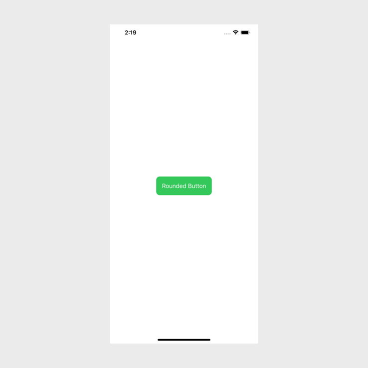
}We have added a corner radius of 10 to our text. If we build and run this it will look like this:
Very straight forward and to me this is quite logical. But I thought it would be the same if we added a stroke. Turns out that it is not the same. In order for us to add a stroke to this we need to update our background modifier. We also need to remove the .forgroundColor modifier and the .cornerRadius modifier for now so that we can see how to add a stoke without a background color. Later on we will take a look at how to add a stroke with a background color.
This is what the code looks like after the update:
var body: some View {
Button(action: {
print("Rounded Button")
}, label: {
Text("Rounded Button")
.padding()
.background(
RoundedRectangle(cornerRadius: 10)
.stroke(lineWidth: 2)
)
})
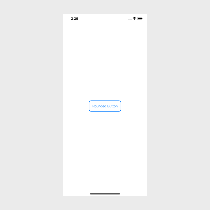
}To get the stroke effect for the button we have passed a RoundedRectangle as a background to our text. This rounded rectangle takes corderRadius as an argument but it also allows us to apply a stroke to it because it is a shape.
If you build and run you should see this:
We can now take a look at how we can have a stroke and a background color on the button. The first thing that we need to do is add in our .foregroundColor again so that we can see the text.
If we take a look at our code we should see that we are passing in a RoundedRectangle which is a shape, and shapes allow us to change their background color.
So to change the background color while keeping the stroke all we need to do is this:
var body: some View {
    Button(action: {
        print("Rounded Button")
    }, label: {
        Text("Rounded Button")
            .padding()
            .foregroundColor(Color.white)
            .background(
                RoundedRectangle(cornerRadius: 10)
                    .stroke(lineWidth: 2)
                    .background(Color.green)
            )
    })
}
If you build and run this you will see the following:
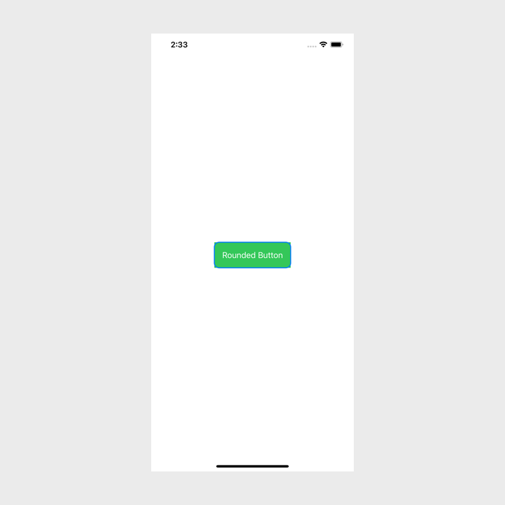
That did not work as expected. The background color is not rounded. The color is a view though, so we can use the modifiers that we could use on a view to round the color, to do this we set the cornerRadius of our color.
Let's update the code to look like the following:
var body: some View {
    Button(action: {
        print("Rounded Button")
    }, label: {
        Text("Rounded Button")
            .padding()
            .foregroundColor(Color.white)
            .background(
                RoundedRectangle(cornerRadius: 10)
                    .stroke(lineWidth: 2)
                    .background(Color.green.cornerRadius(10))
            )
    })
}
All we added was the .cornerRadius(10) as a modifier to the color. If you build and run the app now you should see the following:
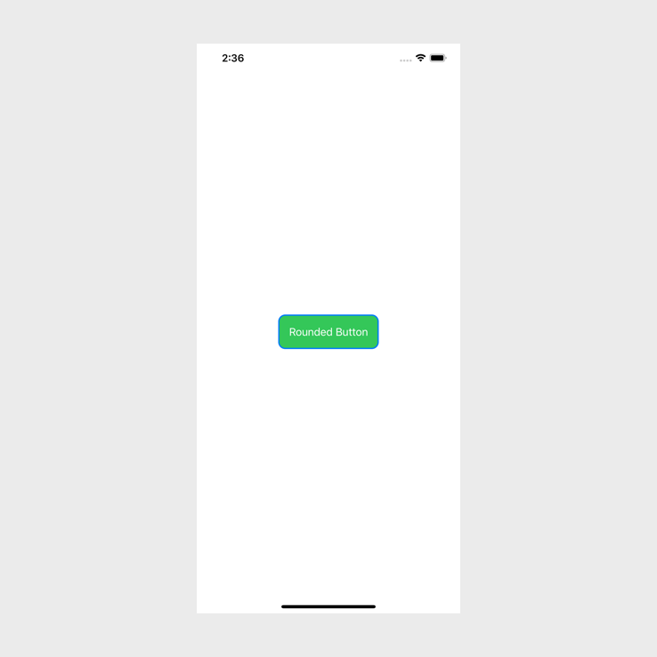
Exactly as expected. Everything is rounded now.
And that is it, that is how we create buttons in SwiftUI and how we style buttons in SwiftUI. Always remember that the second argument for a Button allows you to pass through views, so you can make almost anything a button!
If you want the full source code you can find that here.