Getting started with LazyVGrid/LazyHGrid in SwiftUI

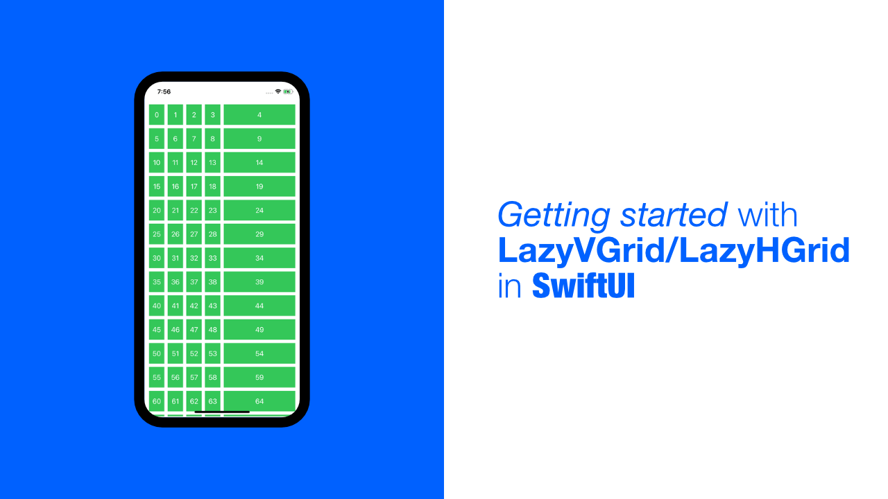
SwiftUI has just been updated and it has some great new features/views. One or two of them being LazyVGrid and LazyHGrid. So, in todays tutorial, we will be going through some of the basics of how to use these two new views.
To start off with, what is LazyVGrid and LazyHGrid? According to Apple, it is a container view that arranges its child views into a grid. When using LazyVGrid the grid will grow vertically, and when using a LazyHGrid the grid will grow horizontally. You can take a look at the Apple docs here(LazyVGrid, LazyHGrid).
So now that we know more about these two views, let's get started with testing them out! But just before we get started, I will be using a clean project(which I assume is obvious, since this stuff is brand new haha) for this tutorial and if you want to take a look at the source code, you can find it here.
LazyVGrid
Let's start with the LazyVGrid. As mentioned before this will allow us to create a grid that grows vertically, but what does the code look like? Replace your ContentView with the following code:
struct ContentView: View {
    // 1
    var vGridLayout = [ GridItem(.flexible()) ]

    var body: some View {
        // 2
        ScrollView {
            // 3
            LazyVGrid(columns: vGridLayout) {
                // 4
                ForEach(0..<100) { value in
                    // 5
                    Rectangle()
                        .foregroundColor(Color.green)
                        .frame(height: 50)
                        .overlay(
                            // 6
                            Text("\(value)").foregroundColor(.white)
                        )
                }
            }.padding(.all, 10)
        }
    }
}
Ok, let's go through this code to see what is happening:
- We create a
GridItemarray. I won't speak on this just yet, I will go through later on. If you want to skip the to explanation you can click here. - We add a
ScrollView. Nothing too exciting with this. The reason that we do this is because our grid is going to be too large, so we need it to scroll. - Finally, we are looking at the
LazyVGridview. TheLazyVGridtakes a few arguments, but we will use only usecolumnsandcontentarguments.columnsmanages the layout of the grid, which is why we needed to createvGridLayoutpreviously, andcontentwill be the views that we want to display in theLazyVGrid. As I mentioned before, we will take a look at theGridItem's just now, that is basically the most important part of the grid. - Simple
ForEachto loop through a range. - Create a
Rectanglethis is for visual purposes to make the layouts easier to understand later on. - We add a
Textview as an overlay. This is also to make it easier to visualise the items with the index number.
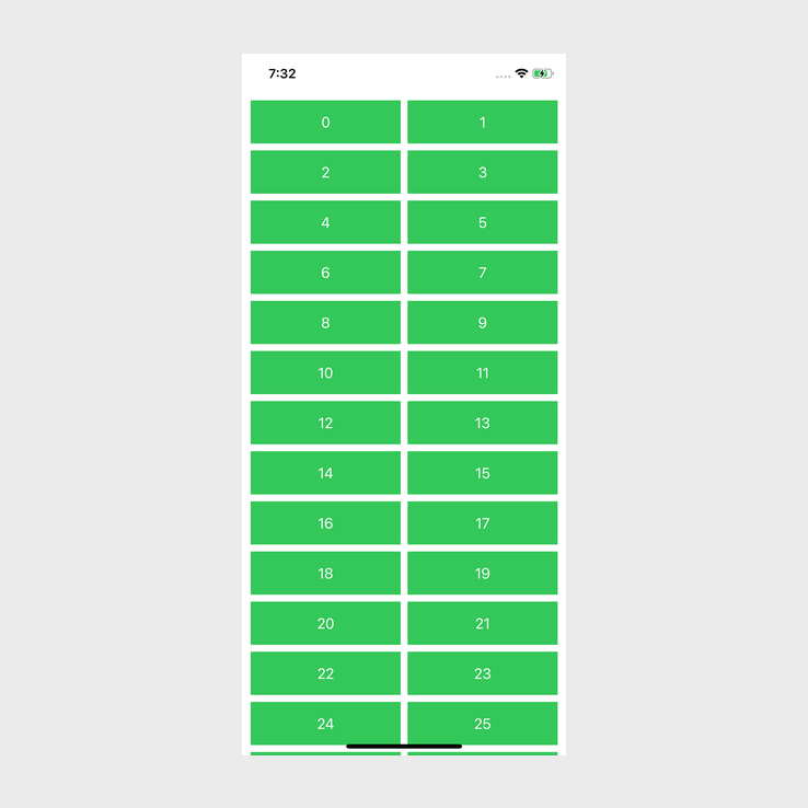
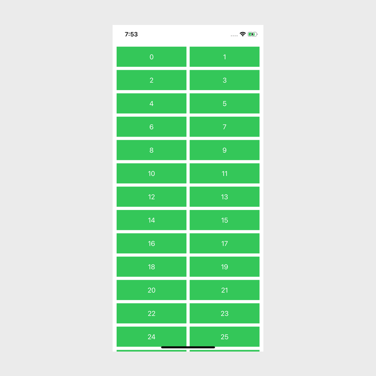
Ok, now that we have gone through the code briefly, let's see what happens if we build and run the app:
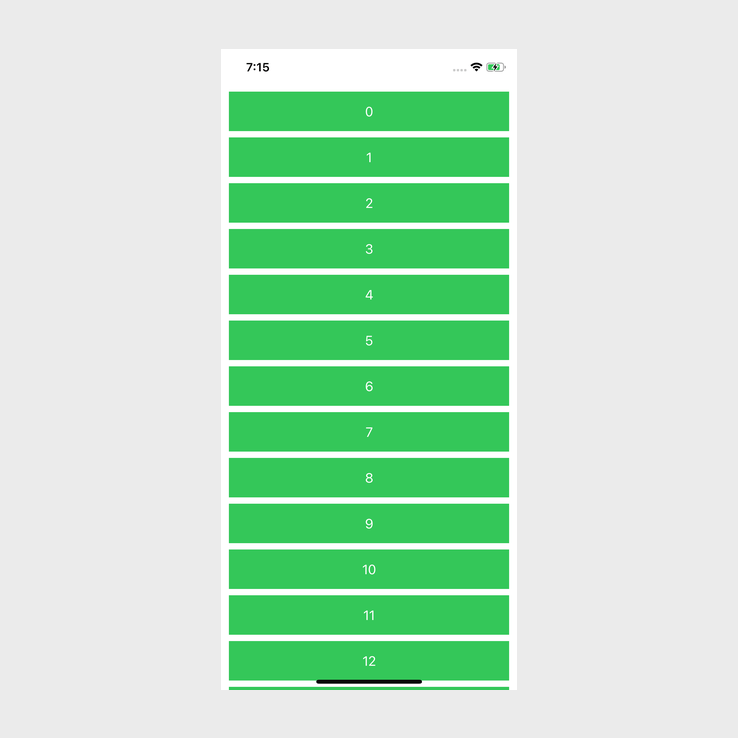
Ok, this looks more like a list than a grid. So what is going on here? This is where the GridItem array comes in, or as we have called it, vGridLayout. The layout of LazyVGrid depends on the GridItem's that we use.
GridItem
GridItem is a struct and it helps us configure the layout of the items(the rows in the above image) in the LazyVGrid or LazyHGrid.
It has a few properties, but the size property is what we will be focusing on. The size property will, as it suggests, allow us to provide or suggest a size for the items that are in our grid.
The GridItem struct also has a nested enum called Size which provides us with different layout characteristics.
Instead of a wall of only text, let's see how changes to vGridLayout will change the layout of the grid that we have.
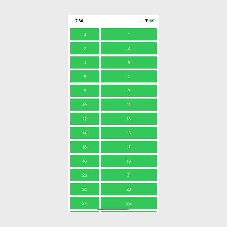
Currently we are using .flexible(), let's change that to the following:
var vGridLayout = [
    GridItem(.flexible(maximum: 100))
]
And when we run the app:
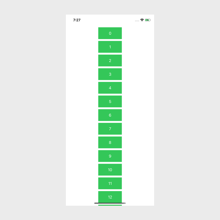
By doing this, we have set a maximum size, in this case, because it is a vertical grid, it will be the width that changes.
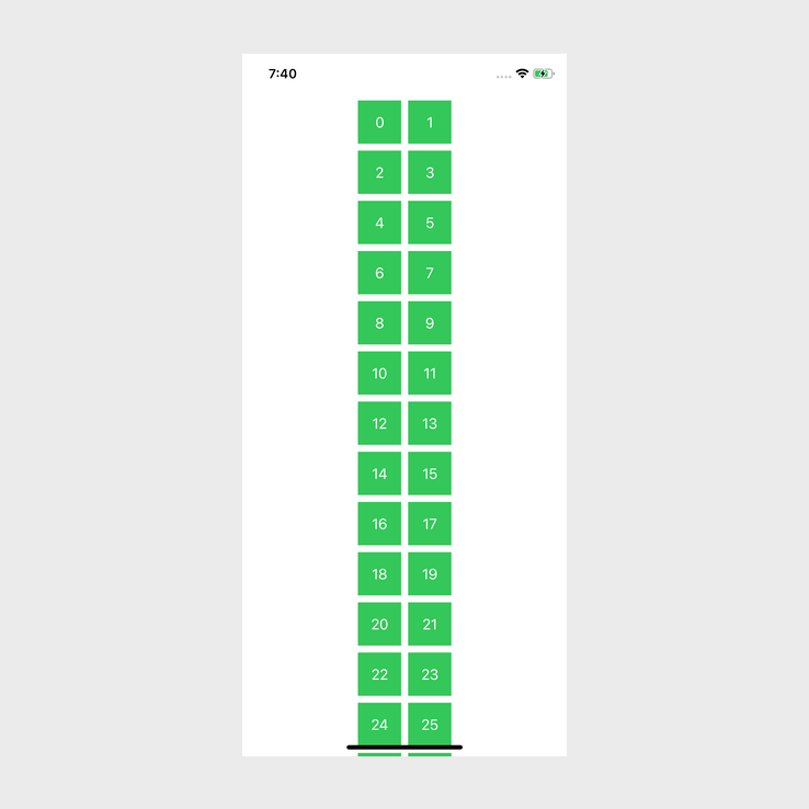
Now, let's add another .flexible() to our grid items:
var vGridLayout = [
    GridItem(.flexible(maximum: 100)),
    GridItem(.flexible())
]
When we build and run:
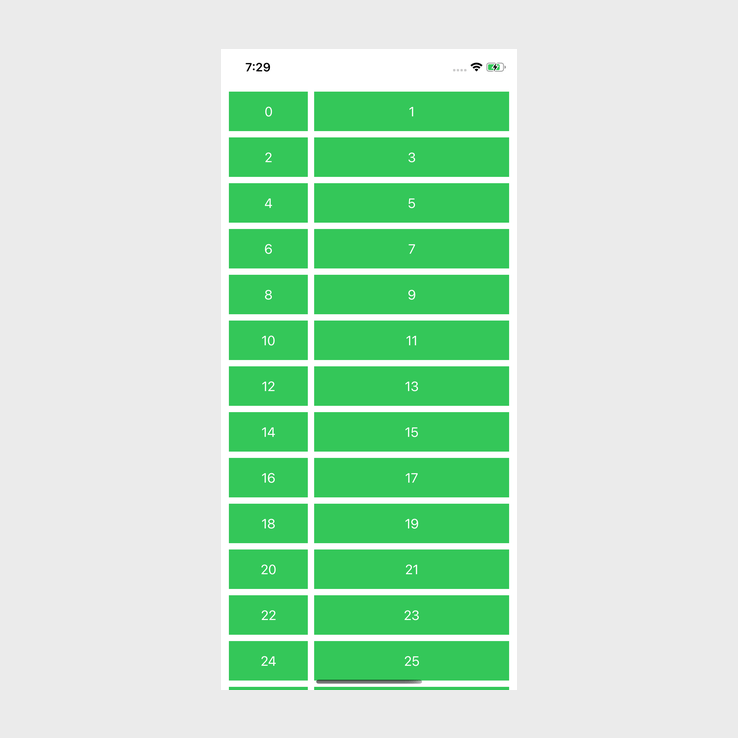
Ah! We are finally seeing a grid! What is happening here though? Well, our first grid item has a maximum size of 100, while our second item does not have a maximum size set. This means that the second column will use up whatever space it can.
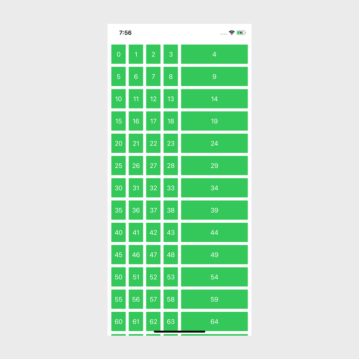
Let's change maximum to minimum, update vGridLayout to the following:
var vGridLayout = [
    GridItem(.flexible(minimum: 30)),
    GridItem(.flexible())
]
Build and run:
Even sizing. This makes sense, we set the minimum value, which just means that the item will not go smaller than that. This size can be affected by other grid items which could lead to it needing to be sized to 30 .
To see this in action, we will update the second grid item to use .fixed(). This does what it says on the tin, it provides a fixed size for the items that will be affected. Update your code with the following:
var vGridLayout = [
    GridItem(.flexible(minimum: 30)),
    GridItem(.fixed(230))
]
Build and run:
There we go, the flexible column in the grid is now narrower while the fixed size column is set to 230.
Next, let's try two .fixed() grid items, update your code with the following:
var vGridLayout = [
    GridItem(.fixed(50)),
    GridItem(.fixed(50))
]
Build and run:
Ok, this is interesting, this is working in a similar way to when we set the maximum size with a single .flexible() grid item. By similar I mean a narrow column of items, but instead of this being a "list", or single column, this is a grid with two columns. This is great! Doing this will allow us to create fixed size columns and rows. The one issue with this is that we would have to do calculations based on screen sizes if we are going to have a multiple columns and we need to add the correct number of GridItem's to the layout array that we are using.
Luckily for us, there is one more surprise from Size, and that is adaptive. Adaptive is quite interesting in its behaviour, so, to explain it, let's first take a look at the documentation:
This size case places one or more items into the space assigned to a singleflexibleitem, using the provided bounds and spacing to decide exactly how many items fit. This approach prefers to insert as many items of theminimumsize as possible but lets them increase to themaximumsize.
adaptive takes two arguments, minimum and maximum, but minimum is required because when using adaptive the grid will try to add as many items of the minimum size into each row in the grid based on the width of the grid.
To better explain, let's try it out, and then we can move on to the next part of the explanation for adaptive. Update vGridLayout with the following:
var vGridLayout = [
    GridItem(.adaptive(minimum: 50))
]
Build and run:
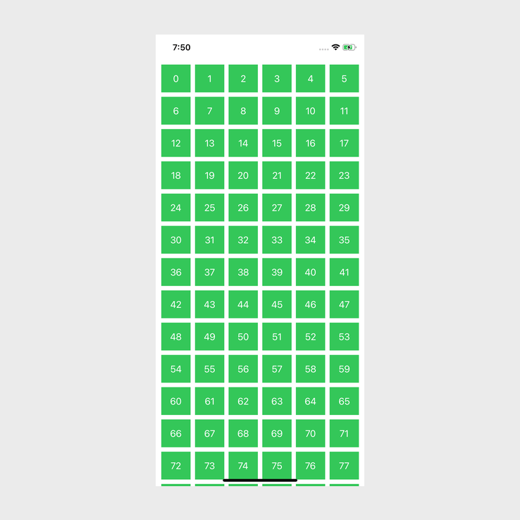
Finally a proper, uniform grid! But also, this provides an easier to understand explanation. All adaptive sizing will do is create as many columns as possible for the minimum size provided.
As another example, let's update 50 to 150:
var vGridLayout = [
    GridItem(.adaptive(minimum: 150))
]
Now that our columns are three times the size, we have three times fewer.
Now let's take a deeper look at the following part of the previously mentioned docs:
This size case places one or more items into the space assigned to a single flexible item, using the provided bounds and spacing to decide exactly how many items fit.What do they mean by a single flexible item? I personally struggled to understand the docs when I read this at first, but when testing it out it becomes much clearer.
Let's update vGridLayout to the following:
var vGridLayout = [
    GridItem(.adaptive(minimum: 30)),
    GridItem(.flexible())
]
Build and run:
What Apple was referring to was that, when, using adaptive and flexible, adaptive will try and add as many columns of the minimum size provided, to match the size of the flexible column. So as you can see above, the adaptive columns have 4 columns compared to the single flexible column.
Hopefully that was a clear enough explanation. When we use the maximum parameter, that will allow ensure that items to not get too large. So, if we update the previous example:
var vGridLayout = [
    GridItem(.adaptive(minimum: 30, maximum: 30)),
    GridItem(.flexible())
]
Build and run:

As you can see, the adaptive columns are smaller now. Previously when we did not use maximum, the item size was allowed to and did become larger than 30. Now, they cannot be larger but there is also no more space to fit another item in. This allows the flexible column to change its size and take up more space.
LazyHGrid
I am not going to go through the LazyHGrid like I went through the LazyVGrid because they are basically the same, but I find the LazyHGrid more confusing due to the way things get laid out.
First thing that we need to do is updated our ContentView:
struct ContentView: View {

    var hGridLayout = [
        GridItem(.flexible(maximum: 100))
    ]

    var body: some View {
        // 1
        ScrollView(.horizontal) {
            // 2
            LazyHGrid(rows: hGridLayout) {
                ForEach(0..<100) { value in
                    Rectangle()
                        .foregroundColor(Color.green)
                        .frame(width: 50) // 3
                        .overlay(
                            Text("\(value)").foregroundColor(.white)
                        )
                }
            }.padding(.all, 10)
        }
    }
}
There are a few updates for LazyHGrid.
- The
ScrollViewwill now become a.horizontalscroll view. LazyVGridbecomesLazyHGridand instead ofcolumnsas the first argument, it takesrows. I have also updated it to usehGridLayoutwhich is the same asvGridLayout.- Instead of height, we use width.
Ok, let's run the above code:
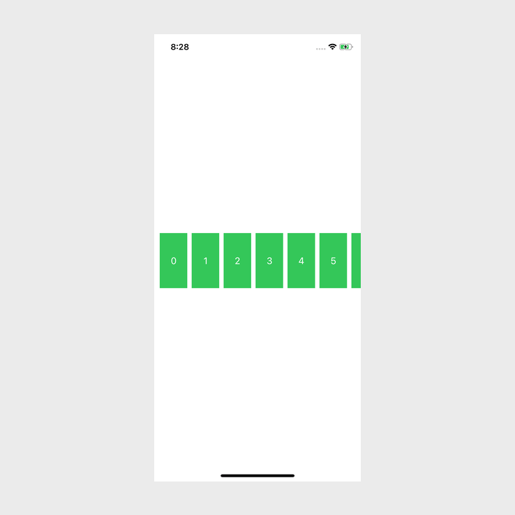
As you can see, this looks the same as LazyVGrid but it is not vertical, which is what we were expecting.
Let's try:
var hGridLayout = [
    GridItem(.flexible(maximum: 100)),
    GridItem(.flexible())
]
Build and run:
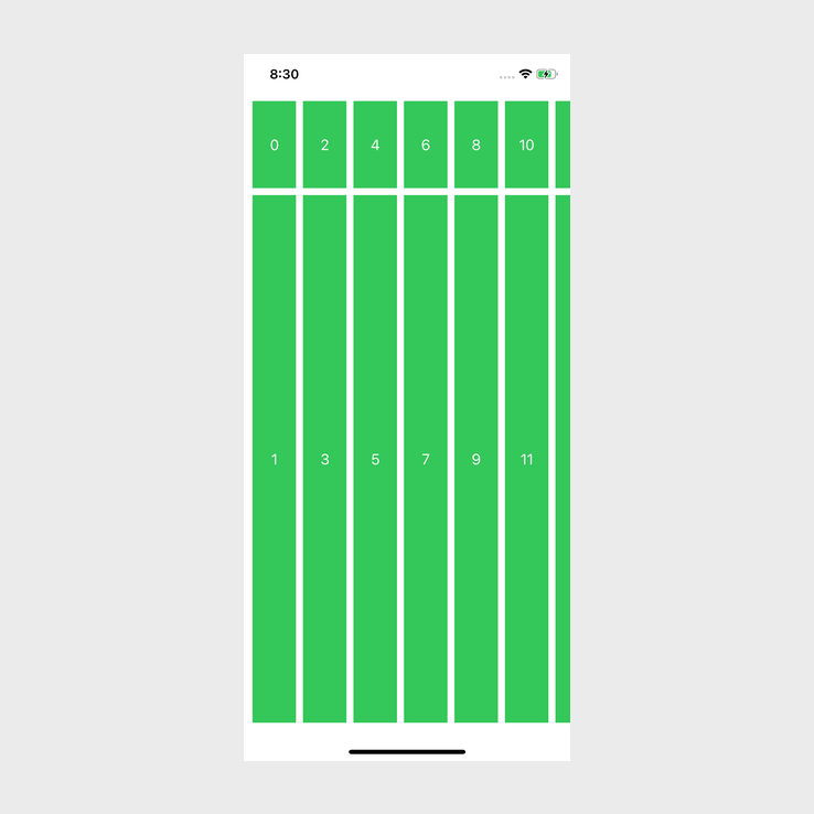
Once again, layout is rotated, but it is basically the same as LazyVGrid.
I encourage you to play around with the other examples that we used when testing out LazyVGrid. Also, one thing that I didn't do in this tutorial was to add more than three GridItem's to either the vGridLayout or to hGridLayout. You can add more GridItem's if you want, I am sure there could be some interesting combinations!
Conclusion
I was never a massive fan of SwiftUI when it came out, it was lacking too many features and it always felt like it was in Beta. This update seems like it could have a lot of the things I was hoping for. At the moment I am really liking how LazyVGrid and LazyHGrid work, hopefully a lot of the new features will be as nice to use.
If you want the full source to the project, you can find it here.