Create a Floating Action Button with SwiftUI
Learn how to create a floating action button with SwiftUI. In this tutorial I will show you how to use ZStack in order to make the button float above the rest of the content

In todays tutorial we will be learning how to create a floating action button using SwiftUI. I have wanted to make a floating action button since SwiftUI came out, but I never got around to it until now. While making this button I realised the power of ZStack, which is what makes building this button so easy.
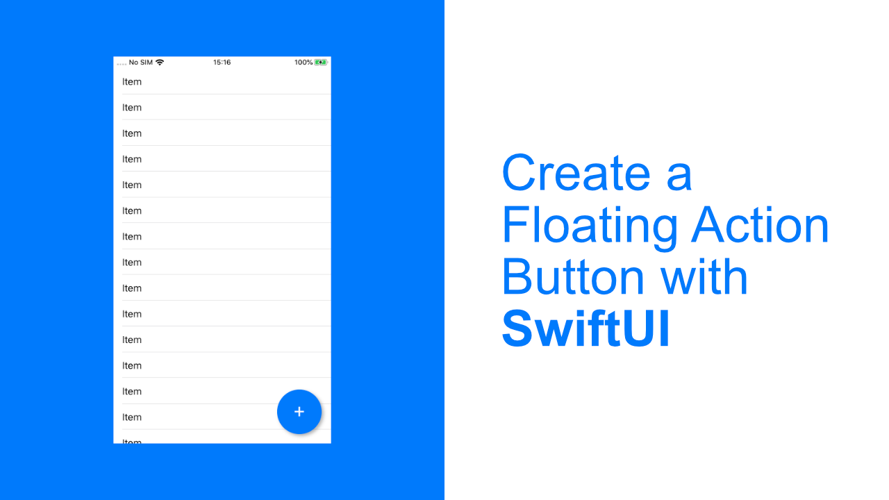
The final product will look like this:

What are we building
In this tutorial we will be building a simple list app. When we tap on the floating action button it will add a new item to the list and the list will update. Pretty simple, but it allows us to see the button float above the list, as well as adding functionality to the button.
Step 1: Create the Item struct
The first thing that I want to do is to create the Item struct. All this struct will need is a uuid and a value. The value will be a string that we can pass through when we tap on the button.
Above your struct ContentView: View add the below code:
struct Item {
    let uuid = UUID()
    let value: String
}
In our ContentView we will have an array of the above Item and our list will have a Text view that will display the value of each Item in the array.
Step 2: Setup the List and view State
When you create a new app your ContentView will look like the below code:
struct ContentView: View {
    var body: some View {
        Text("Hello World")
    }
}
What we need to do now is to add in the items variable which will be the data source for the list, but we also need to add the List.
Update the your ContentView to look like the below:
struct ContentView: View {
    @State private var items = [Item]()

    var body: some View {
        ZStack {
            List(self.items, id: \.uuid) { item in
                Text(item.value)
            }
        }
    }
}
As you can see, we have added a new private variable which is an array of Item.
In the body is where everything will happen. As you can see we have already added in the most important part, the ZStack. This is what will allow our button to float. Inside the ZStack we have add a List view which will display each item that is in the items array.
Step 3: Setting up the button positioning
We are now ready to add the button positioning.
The first thing we need to do now is to add a VStack below our ZStack. Update the body content to look like this:
ZStack {
    List(self.items, id: \.uuid) { item in
        Text(item.value)
    }

    VStack {
        // Basic button holder layout
    }
}
Using the VStack here will allow us to position the button at the bottom of the screen. In order to do that, update your VStack to look like this:
VStack {
    Spacer()
}
All we have done now is replaced the // Basic button holder layout comment with Spacer(). This spacer will allow us to push the button to the bottom of the screen. But to do that we need to add an HStack below the Spacer().
Add the following code below the Spacer() :
HStack {
    Spacer()
}
Your VStack should look like this now:
VStack {
    Spacer()

    HStack {
        Spacer()
    }
}
Inside the HStack we have put another Spacer(). This works in the same way that the Spacer() in the VStack works, except using an HStack the Spacer() will allow us to move content to the left or right instead of up and down.
Step 4: Add the button
Now that we have all the positioning done, all we need to do is to add the button.
Add the following code below the Spacer() in the HStack:
Button(action: {
    self.items.append(Item(value: "Item"))
}, label: {
    Text("+")
})
This button will have a "+" as its text, and every time we tap on it, it will add a new item to the list. Each item will have the same value of "item", you can change this if you want, but I kept it simple as this is not the focus of this tutorial.
After you have added the button, the app should look like this:
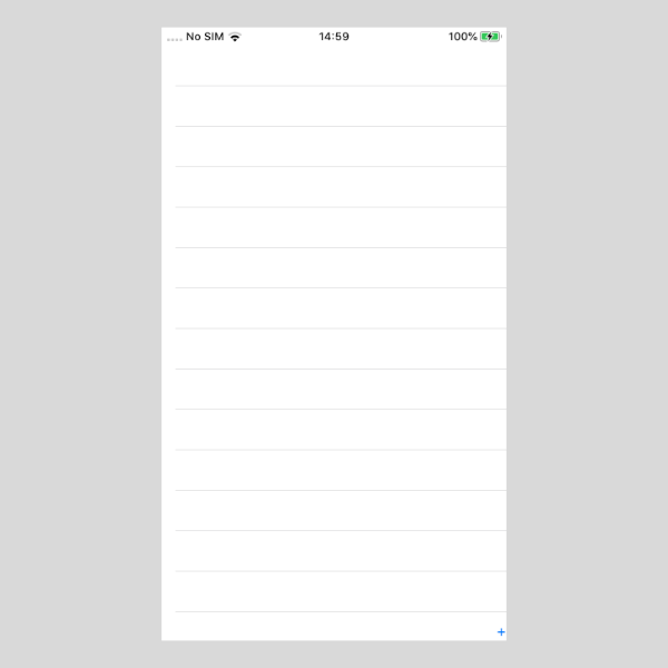
Ok, this is not what I promised in the beginning. But functionally it should work, it just needs to be styled properly.
Step 5: Add button styling
The first part of the styling will be to update the styling of the Text view. To do this, replace the current Text view in the Button with this:
Text("+")
    .font(.system(.largeTitle))
    .frame(width: 77, height: 70)
    .foregroundColor(Color.white)
    .padding(.bottom, 7)
This will use a bigger font, we will also set the frame which is important because the button size is influenced by this. We then change the text color to be white and finally we add some padding to the bottom. Without the padding the text is not vertically centered in the Button.
I would add a screenshot, but since we changed the text color to white you won't be able to see the button. There is no point to an invisible button, so lets update the button itself so that we can clearly see it.
Replace your button code with the following code:
Button(action: {
    self.items.append(Item(value: "Item"))
}, label: {
    Text("+")
        .font(.system(.largeTitle))
        .frame(width: 77, height: 70)
        .foregroundColor(Color.white)
        .padding(.bottom, 7)
})
.background(Color.blue)
.cornerRadius(38.5)
.padding()
.shadow(color: Color.black.opacity(0.3),
        radius: 3,
        x: 3,
        y: 3)
This is the full Button code. You can see our Text view still has all of its styling, but now the Button also has styling.
What did we do? We added a background color to our Button so that we can see it. We then rounded the corners by setting the radius to 38.5, which is half of 77, which is the width of the Text view. After that we added some padding, and then lastly we added a small shadow.
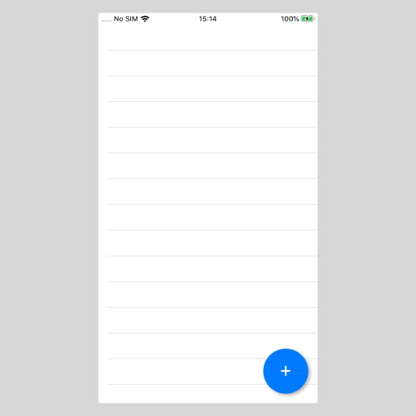
If you build and run the app now it should look like this:
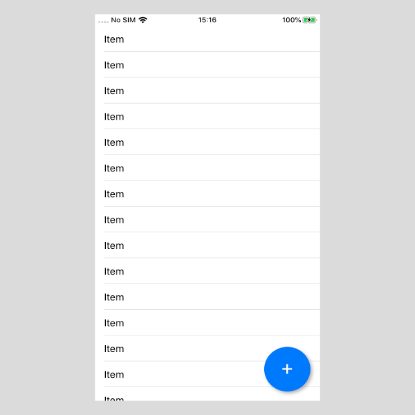
And there it is, a floating button. If you tap on it the list should update with new items, it should look like this:
If you are not seeing the above, then double check your code with the below code. This is the code that I am running to get the above functionality.
import SwiftUI

struct Item {
    let uuid = UUID()
    let value: String
}

struct ContentView: View {
    @State private var items = [Item]()

    var body: some View {
        ZStack {
            List(self.items, id: \.uuid) { item in
                Text(item.value)
            }

            VStack {
                Spacer()

                HStack {
                    Spacer()

                    Button(action: {
                        self.items.append(Item(value: "Item"))
                    }, label: {
                        Text("+")
                        .font(.system(.largeTitle))
                        .frame(width: 77, height: 70)
                        .foregroundColor(Color.white)
                        .padding(.bottom, 7)
                    })
                    .background(Color.blue)
                    .cornerRadius(38.5)
                    .padding()
                    .shadow(color: Color.black.opacity(0.3),
                            radius: 3,
                            x: 3,
                            y: 3)
                }
            }
        }
    }
}
If you liked this tutorial, please share it with others that might enjoy it too!