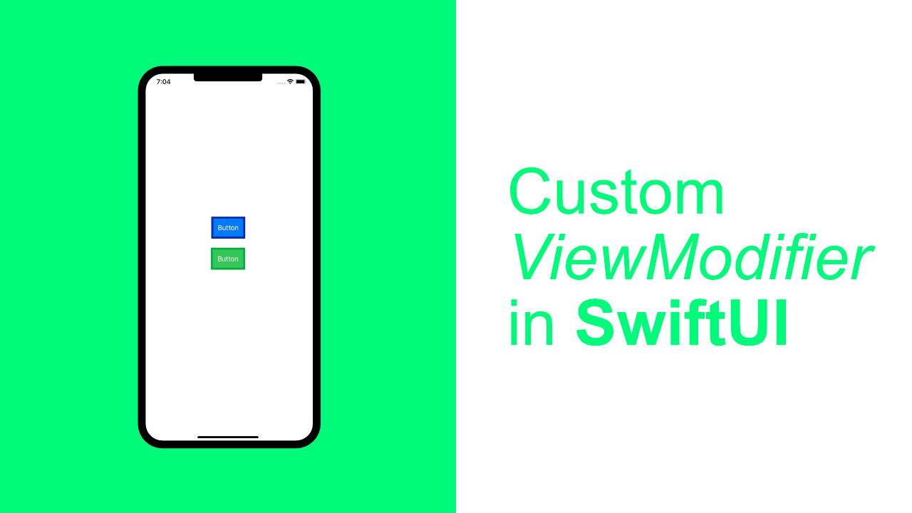
Create a Custom ViewModifier in SwiftUI

In today's tutorial we will be learning about the ViewModifier protocol. In Apple's documentation they define a ViewModifier as follows:
A modifier that you apply to a view or another view modifier, producing a different version of the original value
One of the simplest ways to use a ViewModifier is to group duplicate styling for views. So if you have a blue and green button and it requires a certain border width, then it would make sense to create a ViewModifier that will allow you to encapsulate the styling and logic required to make the view look as it should.
In this tutorial we will be creating three ViewModifiers. Each example will show a different way to use ViewModifiers. Because we will be using structs to create these custom ViewModifiers, we will have access to all the functionality of a regular struct, which gives us the ability to create very powerful ViewModifiers, far beyond simple styling modifiers.
Let's get started with the basics, styling views with a modifier.
ViewModifier requirements
ViewModifier is a protocol. In order to conform to the ViewModifier protocol you only need to implement one method.
struct BasicViewModifier: ViewModifier {
    func body(content: Content) -> some View {
        return content
    }
}
The above code will do nothing, but it shows the most basic implementation of the ViewModifier protocol.
Step 1: Styling View's with a ViewModifier
Now that we have the basics down we can start creating our first ViewModifier.
To do this create a new struct called GreenButtonStyle. This will allow us to easily create a green button that has a darker green border. The code looks like this:
struct GreenButtonStyle: ViewModifier {
    func body(content: Content) -> some View {
        return content
        .foregroundColor(.white)
        .background(Color.green)
        .border(Color(red: 7/255,
                      green: 171/255,
                      blue: 67/255),
                width: 5)
    }
}
The content works in the same way as a View does for styling or adding gestures. As per Apple's documentation where they say that a ViewModifier is a modifier that you can apply to a View or a ViewModifier.
In this GreenButtonStyle modifier we use the .foregroundColor to make the text color white. We then change the background color to be the default green that Apple provides, and lastly we add a border. This border is a darker green and we set the width to 5.
Let's add a button to our app and use this modifier on it.
Replace your ContentView with the following:
struct ContentView: View {
    var body: some View {
        Button(action: {
            print("Button Pressed")
        }, label: {
            Text("Button").padding()
        })
        .modifier(GreenButtonStyle())
    }
}
To use the modifier we use a method called modifier. In the above example we create a new instance of GreenButtonStyle, which is passed through to the modifier method. You might start to see the power of this, being able to pass a struct will allow us to some very interesting things. Later on in this article we will go through some more advanced use cases.
If you run the app now it should look like this:
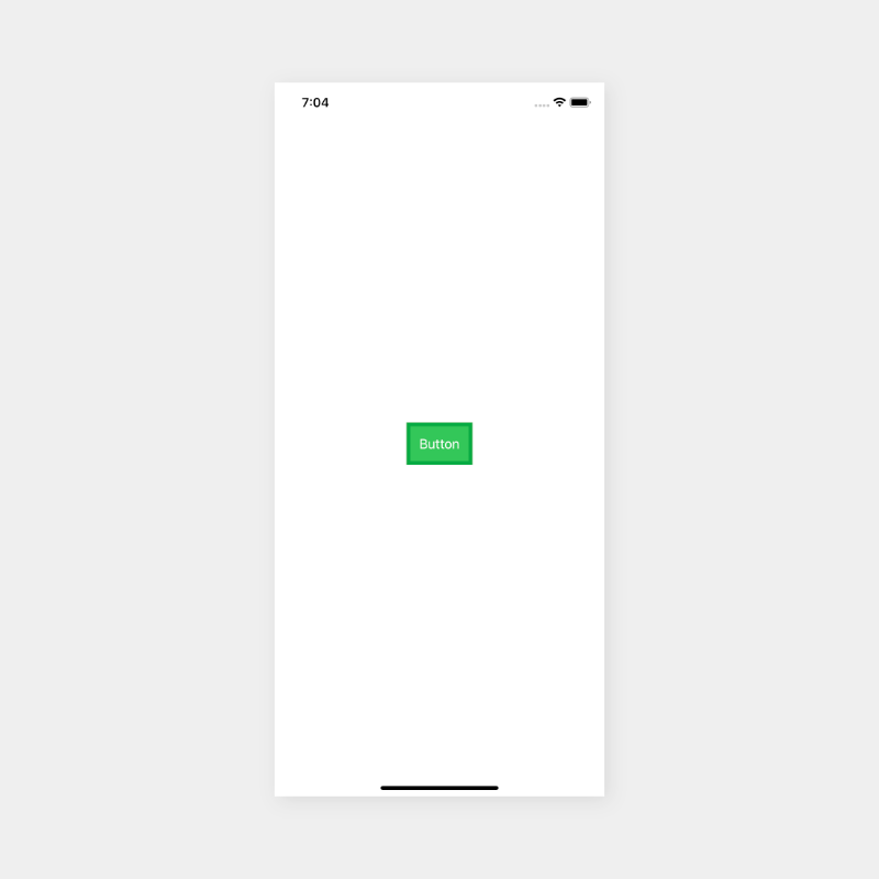
We called our ViewModifier GreenButtonStyle but this modifier will actually work on other any other view. This is one of the reasons why ViewModifiers are so powerful.
If we wanted we could easily create a BlueButtonStyle ViewModifier. Let's quickly do that.
struct BlueButtonStyle: ViewModifier {
func body(content: Content) -> some View {
return content
.foregroundColor(.white)
.background(Color.blue)
.border(Color(red: 7/255,
green: 42/255,
blue: 171/255),
width: 5)
}
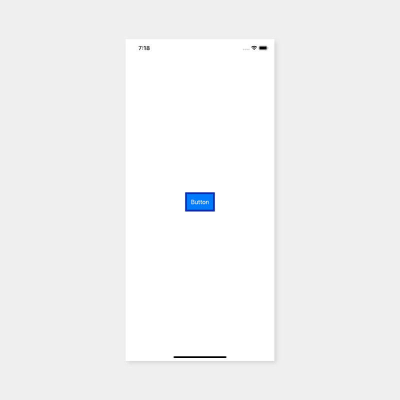
}Now you can replace GreenButtonStyle with BlueButtonStyle and your button will be blue. If you run your app now, it should look like this:
Cleanup
I wasn't planning on cleaning this code up, but it should be quick enough to get it look a bit better. I am sure that this code could be cleaned up more, but like I say, this was not a planned part of this tutorial :)
Create a new struct and call it StyledButton:
struct StyledButton: ViewModifier {
    enum ButtonColor {
        case green
        case blue

        func backgroundColor() -> Color {
            switch self {
            case .green:
                return Color.green
            case .blue:
                return Color.blue
            }
        }

        func borderColor() -> Color {
            switch self {
            case .green:
                return Color(red: 7/255,
                             green: 171/255,
                             blue: 67/255)
            case .blue:
                return Color(red: 7/255,
                             green: 42/255,
                             blue: 171/255)
            }
        }
    }

    let buttonColor: ButtonColor

    func body(content: Content) -> some View {
        return content
            .foregroundColor(.white)
            .background(buttonColor.backgroundColor())
            .border(buttonColor.borderColor(),
                    width: 5)
    }
}
The above ViewModifier is quite simple. If we take a look at the body method right at the bottom we see that it is the same as our GreenButtonStyle and BlueButtonStyle. The big difference with this part is that we are using buttonColor instead of Color.
The reason for this is because we have moved all the color logic into an enum called ButtonColor. This enum has two cases, green and blue. It also has two methods, backgroundColor and borderColor. This allows us to easily get our background color and our border color based on what value we use to initialise our StyledButton.
We control the color with our buttonColor property. The property is of type ButtonColor, this will allow us to pass through the color that we want when we create a new instance of StyledButton.
Let's see how this works in action. Replace your ContentView with the following:
struct ContentView: View {
    var body: some View {
        Button(action: {
            print("Button Pressed")
        }, label: {
            Text("Button").padding()
        })
        .modifier(StyledButton(buttonColor: .blue))
    }
}
The only change is with the modifier. Instead of GreenStyleButton or BlueStyleButton we use StyledButton. The StyledButton takes an argument for buttonColor. In this case I am passing .blue as the button color. If you run the app now it will look the same as it did when we used BlueButtonStyle.
Step 2: Button tap tracking
Recently I had to implement some analytics on a project, this got me thinking about how it would be done in SwiftUI.
When I was reading up on ViewModifiers it dawned on me that this is a possible way, but probably not a great way. This next example is more for concept/demonstration purposes.
For this part we will create a new struct called Track and it will take one argument called eventName.
struct Track: ViewModifier {
    let eventName: String

    func body(content: Content) -> some View {
        return content.simultaneousGesture(TapGesture().onEnded({
            print(self.eventName)
        }))
    }
}
You might have noticed that I used something called a simultaneousGesture, without this I could not print the value in the Button action as well as print this.
If you look at Apple's docs it says this about the simultaneousGesture:
Attachesgestureto self such that it will be processed simultaneously with gestures defined byself- Apple
This is a way to add other gestures onto View's that already have gestures. For example, if you used onTapGesture, it would not work, you need to put it into a simultaneousGesture.
This is the only complicated/tricky thing with this modifier. The main reason for Step 2 was to show you something that you could use a ViewModifier for other than just styling.
To test the above out, replace your ContentView with the following:
struct ContentView: View {
    var body: some View {
        Button(action: {
            print("Button Pressed")
        }, label: {
            Text("Button").padding()
        })
        .modifier(Track(eventName: "simpleEvent"))
    }
}
Once again the only that has changed is the .modifier, instead of StyledButton we pass Track as the argument.
Step 3: Multiple ViewModifiers
In the previous step we removed the StyledButton modifier. If you want to add the tracking as well as the styling, update your ContentView to look like this:
struct ContentView: View {
    var body: some View {
        Button(action: {
            print("Button Pressed")
        }, label: {
            Text("Button").padding()
        })
        .modifier(Track(eventName: "simpleEvent"))
        .modifier(StyledButton(buttonColor: .blue))
    }
}
As you can see, all we done was add a new modifier. If you wanted to, you could add more ViewModifiers. You would even be able to create a new ViewModifier that just applies specific ViewModifiers.
Step 4: ViewModifiers with @State
Each example that we have done previously has been building up to this. In this step we are going to create a ViewModifier that changes the Button's border based on how many times the user has tapped the button.
One use case for this type of ViewModifier could be a toggle control, or if you change it up but keep the idea of @State, you could create some really advanced ViewModifiers depending on what your app requires.
None of this code is complicated, but instead of sharing the final code immediately, I am going to build it up incrementally and explain each part.
Create the base struct
Let's start with the base struct. We will call it BorderChange. For the base implementation we are going to set the Button border to be black and have a borderWidth of 5.
struct BorderChange: ViewModifier {
    func body(content: Content) -> some View {
        return content.border(Color.black, width: 5)
    }
}
Replace your ContentView with the following:
struct ContentView: View {
var body: some View {
Button(action: {
print("Button Pressed")
}, label: {
Text("Button").padding()
})
.modifier(BorderChange())
}
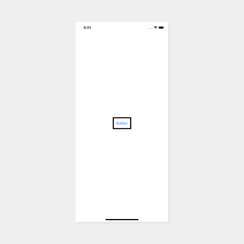
}If you build and run the app now your app will look like this:

Create the BorderColor enum
Insider the BorderChange ViewModifier we need to add an enum called BorderColor. Doing so will allow us to add in a currentState property which we will use later on when we toggle between the different colors.
Add the following enum and property inside the BorderChange above the body function.
enum BorderColor {
    case black
    case blue
    case red

    func color() -> Color {
        switch self {
        case .black:
            return .black
        case .blue:
	        return .blue
        case .red:
            return .red
        }
    }
}

@State var currentState = BorderColor.black
We created an enum for the colors that we want to support, and then we have a function called color that has a return type of Color so that we can use it to set the color of our views' border.
currentState uses the @State property wrapper because this is the value that will be changing later on when we tap the button.
Next, let's update the body function. Replace the body function with the following:
func body(content: Content) -> some View {
    return content.border(self.currentState.color(), width: 5)
}
The change here is that instead of using Color.black as the first argument for the border function, we use self.currentState.color().
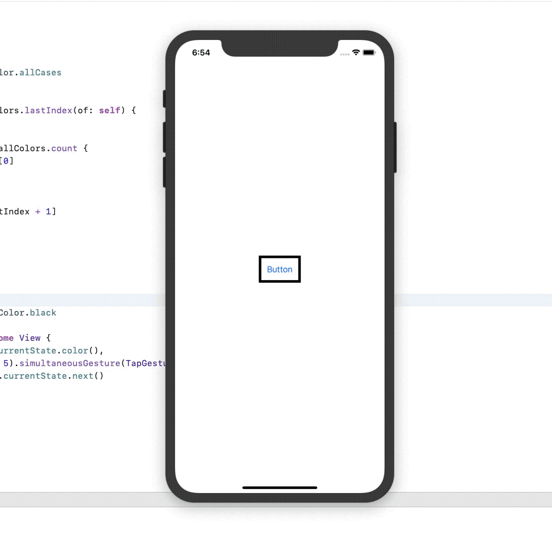
If you build and run your app it will look like this:
Add the color rotation logic
By color rotation logic all I mean is that we will be adding a new method to our BorderColor that will allow the buttons border color to change on each tap as well as let it cycle between the colors indefinitely.
The first thing we need to do is to change the BorderColor enum to conform to CaseIterable. Doing this will allow us to loop through the cases in BorderColor.
Update your BorderColor to look like the below:
enum BorderColor: CaseIterableNow, let's add the next method so that we can cycle through all the colors:
func next() -> BorderColor {
    // 1
    let allColors = BorderColor.allCases

    // 2
    if let lastIndex = allColors.lastIndex(of: self) {

        // 3
        if lastIndex + 1 == allColors.count {
            return allColors[0]
        }

        // 4
        return allColors[lastIndex + 1]
    }
    // 5
    return self
}.allCasesreturns a collection of all the cases in ourBorderColorenum.- We get the
lastIndexof our current value from theallColorscollection. Using thelastIndexis fine in this example because we are using an enum which does not allow duplicate values, therefore thelastIndexwill always return the correct value. - We check to see if the
lastIndex+ 1 will be the same size as theallColorscollection. If it is, we return the first color from ourallColorscollection. - Return the next color.
- If the
lastIndexisnilwe just return self.
Button tap logic
Now that we have all the logic completed for our BorderColor enum, we can move on to the last piece of our code. When the user taps the button we need to cycle through the colors and change the buttons border color.
Update your body function to look like this:
func body(content: Content) -> some View {
    return content.border(self.currentState.color(),
                          width: 5).simultaneousGesture(TapGesture().onEnded({
        self.currentState = self.currentState.next()
    }))
}
What we have done here is added a new TapGesture. Normally when you add a TapGesture you would use .onTapGesture, but in this case we cannot. Because the button already responds to a TapGesture we need to use a simultaneousGesture.
According to Apple's documentation, the simultaneousGesture will allow us to add another gesture that will be processed simultaneously with the gestures defined by the view.
Attaches a gesture to the view to process simultaneously with gestures defined by the view - Apple
When our gesture ends we updated the currentState by calling the next() method. We use the return value from next() to update our currentState. When we do that our buttons border color will change to the next color in our BorderColor enum because the currentState property has the @State property wrapper.
If you build and run your app should look and function like the below:
I hope you found this tutorial helpful. ViewModfiers can be a powerful tool and I am sure that more and more use cases will be found for them.
Full source code can be found here