SwiftUI Progress bar/indicator

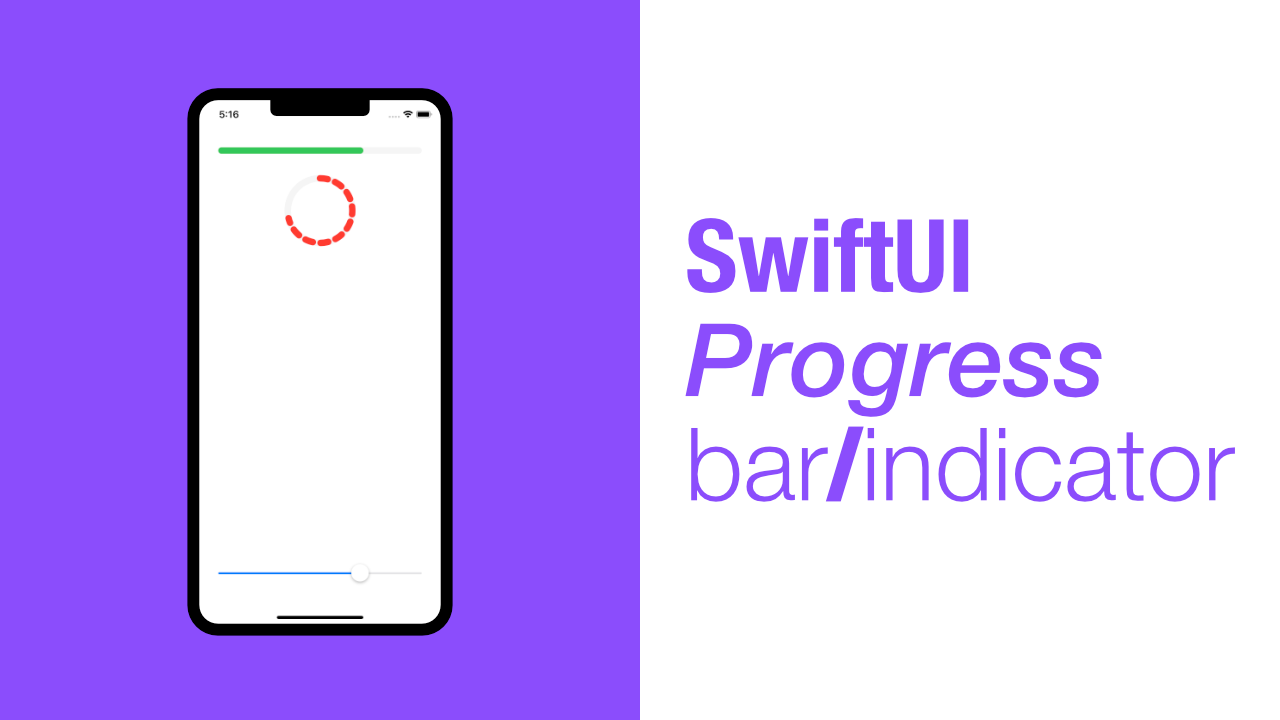
In this tutorial I will show you how to create a progress bar/indicator using SwiftUI. SwiftUI makes creating the progress bar/indicator very simple. We will learn how to create a normal progress bar but also a circular progress indicator.
Before we get started I need to mention that there is quite a bit of code duplication as I am creating the linear progress bar as a separate View and the circular indicator as a separate View. If this was a library or framework it would not make sense to do it like I am doing it, but this is for tutorial purposes.
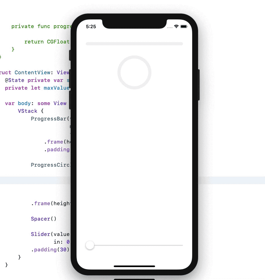
This is what we are going to build. Very simple, don't let the dotted appearance of the circle progress indicator scare you off, we will allow for a dotted and a line based stroke.
Step 1: Setting up the ContentView
The first thing we need to do is to setup our default ContentView. The ContentView needs two properties, one for the current state of the progress bar/indicator, and one for the max value of the progress bar.
We will also need to setup a basic layout. To simulate the progress state we will use a Slider.
Let's replace our ContentView with the following:
struct ContentView: View {
    @State private var sliderValue: Double = 0
    private let maxValue: Double = 10

    var body: some View {
        VStack {
            Text("Progress bar/indicator will go here")

            Spacer()

            Slider(value: $sliderValue,
                   in: 0...maxValue)
                .padding(30)
        }
    }
}
As you can see, we have our two properties. One is our sliderValue which we will pass through to each progress bar/indicator that we create.
The maxValue is there due to duplication, we will be using it multiple times, so it is just a bit easier to create a let for it.
Step 2: Create the Progress bar/indicator view
We can now create our ProgressBar view. I am going to show the code first, and then run through it:
struct ProgressBar: View {
    private let value: Double
    private let maxValue: Double
    private let backgroundEnabled: Bool
    private let backgroundColor: Color
    private let foregroundColor: Color

    init(value: Double,
         maxValue: Double,
         backgroundEnabled: Bool = true,
         backgroundColor: Color = Color(UIColor(red: 245/255,
                                                green: 245/255,
                                                blue: 245/255,
                                                alpha: 1.0)),
         foregroundColor: Color = Color.black) {
        self.value = value
        self.maxValue = maxValue
        self.backgroundEnabled = backgroundEnabled
        self.backgroundColor = backgroundColor
        self.foregroundColor = foregroundColor
    }
}
This will give you an error, but don't worry, we will sort that out soon.
What is happening here? The two most important properties will be the value and maxValue properties. These will be used to update the View to show what progress has been made.
The value property will be the sliderValue that we created in Step 1, the maxValue in ProgressBar will come from the maxValue property that we created in Step 1.
The backgroundColor will be used to set the background Capsule's foreground color, this sounds strange but it will make sense later on. The backgroundEnabled will allow us to show and hide the background Capsule, and finally the foregroundColor will be used to set the foreground color of our foreground Capsule.
As you can see, the init has default values for backgroundEnabled, backgroundColor and foregroundColor.
The background and foreground color default values are a bit dirty in terms of the code, it would have been better to have created something like a config struct which would have two functions, one for each color, that way one would not need to change the actual View code.
That struct could have looked like this:
struct ProgressConfig {
    static func backgroundColor() -> Color {
        return Color(UIColor(red: 245/255,
                             green: 245/255,
                             blue: 245/255,
                             alpha: 1.0))
    }

    static func foregroundColor() -> Color {
        return Color.black
    }
}
Or better yet, we could have created a config protocol that would allow developers to create configs however they want, and then we could add another property to our view that will allow us to inject a config, this could help out with testing, but we will not get into this in this tutorial.
Create the ProgressBar body
Ok, now that we have all our properties and our init, we can get to the body of our View.
Add this code below the init:
var body: some View {
    // 1
    ZStack {
        // 2
        GeometryReader { geometryReader in
            // 3
            if self.backgroundEnabled {
                Capsule()
                    .foregroundColor(self.backgroundColor) // 4
            }

            Capsule()
                .frame(width: geometryReader.size.width) // 5
                .foregroundColor(self.foregroundColor) // 6
                .animation(.easeIn) // 7
        }
    }
}
The body is quite simple. We have two Capsule views and we add a few styles to them. We have also wrapped our Capsule views in a GeometryReader, I will explain this just now.
- We use a
ZStackbecause we need twoCapsuleviews, and the oneCapsulewill be used as a backgroundCapsulewhile the other will be the foregroundCapsule.ZStackallows us to put views "on top" of one another. GeometryReader, we need theGeometryReaderfor the width of the secondCapsule.- We check to see if we need to show the background
Capsuleor not. - This is where we set the background
Capsule's color. To set the color we need to set theforegroundColorof our backgroundCapsule, that is why we named the propertybackgroundColor. - We now get to use our
GeometryReader. The secondCapsule(which will be the foregroundCapsule) needs to have its size calculated based on thevalueandmaxValuethat weinitourProgressBarwith. Below is a method that will do this calculation. - We now use our
foregroundColorfor our foregroundCapsule. - Lastly we add animation to our foreground
Capsuleso that when ourvaluechanges, the foregroundCapsulewill animate to the new size.
There is one last thing that we need to do for our ProgressBar. We need to have our foreground Capsule size be set based on the value that we pass to our ProgressBar.
To do this, let's add a new method called progress, which will return the width of the foreground Capsule. Add this method below our body:
private func progress(value: Double,
                      maxValue: Double,
                      width: CGFloat) -> CGFloat {
    let percentage = value / maxValue
    return width *  CGFloat(percentage)
}
This will use our value and maxValue to find the percentage of progress. We then return the width multiplied by the percentage to give us the correct width of our foreground Capsule.
We can now update our foreground Capsule to use our new progress method. To do this, replace the foreground Capsule with the following:
Capsule()
    .frame(width: self.progress(value: self.value,
                                maxValue: self.maxValue,
                                width: geometryReader.size.width))
    .foregroundColor(self.foregroundColor)
    .animation(.easeIn)
Let's test this out. Update your ContentView to look like this:
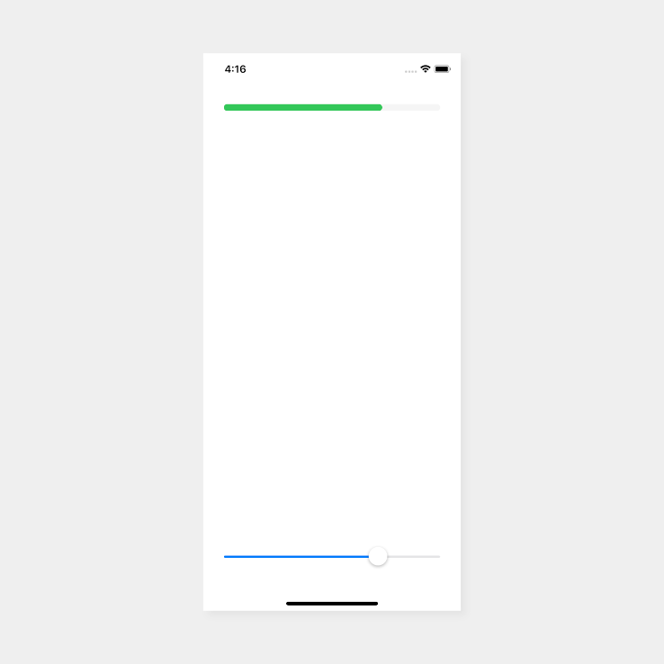
If you drag the slider at the bottom, you will see the progress bar move accordingly.
Step 3: Create a Circular Progress bar/indicator view
The ProgressCircle is very similar to the ProgressBar we just created. The biggest difference are the properties, but there are only two more properties that we need to add. One of those properties requires an enum to be created.
Let's start with the properties and the init of our ProgressCircle:
struct ProgressCircle: View {
    enum Stroke {
        case line
        case dotted

        func strokeStyle(lineWidth: CGFloat) -> StrokeStyle {
            switch self {
            case .line:
                return StrokeStyle(lineWidth: lineWidth,
                                   lineCap: .round)
            case .dotted:
                return StrokeStyle(lineWidth: lineWidth,
                                   lineCap: .round,
                                   dash: [12])
            }
        }
    }

    private let value: Double
    private let maxValue: Double
    private let style: Stroke
    private let backgroundEnabled: Bool
    private let backgroundColor: Color
    private let foregroundColor: Color
    private let lineWidth: CGFloat

    init(value: Double,
         maxValue: Double,
         style: Stroke = .line,
         backgroundEnabled: Bool = true,
         backgroundColor: Color = Color(UIColor(red: 245/255,
                                                green: 245/255,
                                                blue: 245/255,
                                                alpha: 1.0)),
         foregroundColor: Color = Color.black,
         lineWidth: CGFloat = 10) {
        self.value = value
        self.maxValue = maxValue
        self.style = style
        self.backgroundEnabled = backgroundEnabled
        self.backgroundColor = backgroundColor
        self.foregroundColor = foregroundColor
        self.lineWidth = lineWidth
    }
}
Nothing too complicated. Let's ignore the enum quickly and talk about the difference.
The ProgressCircle has two extra properties, style and lineWidth. Our ProgressBar line width was based on the frame height, but the ProgressCircle is not, so we need to pass that value when we init the ProgressCircle.
The style property allows us to make our ProgressCircle have a .line or .dotted stroke. That is why we need the enum which is called Stroke.
Our Stroke enum has two cases, .line and .dotted. The Stroke enum also has a method called strokeStyle this will return a StrokeStyle which will be determined by whether we are using .line or .dotted.
Add the ProgressCircle body
Now that we are done with our properties and init, we can add the body to our ProgressCircle.
Add the following code below the init:
var body: some View {
    ZStack {
        if self.backgroundEnabled {
            Circle()
                .stroke(lineWidth: self.lineWidth)
                .foregroundColor(self.backgroundColor)
        }

        Circle()
            .trim(from: 0, to: CGFloat(self.value / self.maxValue))
            .stroke(style: self.style.strokeStyle(lineWidth: self.lineWidth))
            .foregroundColor(self.foregroundColor)
            .rotationEffect(Angle(degrees: -90))
            .animation(.easeIn)
    }
}
This is very similar to the ProgressBar, the major part that is missing is the GeometryReader, because we do not need to calculate the length of our foreground Circle.
Once again we use a ZStack because we need our two Circle views to be above one another.
We then check if the background Circle needs to be enabled or not.
Instead of just setting the background color, like we did for the ProgressBar Capsule views, we also need to set our stroke lineWidth using our lineWidth property. This is done for both the foreground and background Circle views.
To get the foreground Circle to draw the correct amount of stroke we need to trim it. To do this we use the trim method on Circle which takes a from value and a to value. The from value is set to 0 as that will be the starting point, the to value will come from the value and maxValue properties. We divide the value by the maxValue which will trim the stroke to the correct length.
When we add the stroke we use our strokeStyle method that is part of our Stroke enum. This requires us to pass in a lineWidth so that it can set the correct lineWidth when it creates a new instance of StrokeStyle.
Due to the way that Circle views get drawn, we need to rotate our foreground Circle by -90 degrees, otherwise the stroke will start drawing at 90 degrees, which is not what we want.
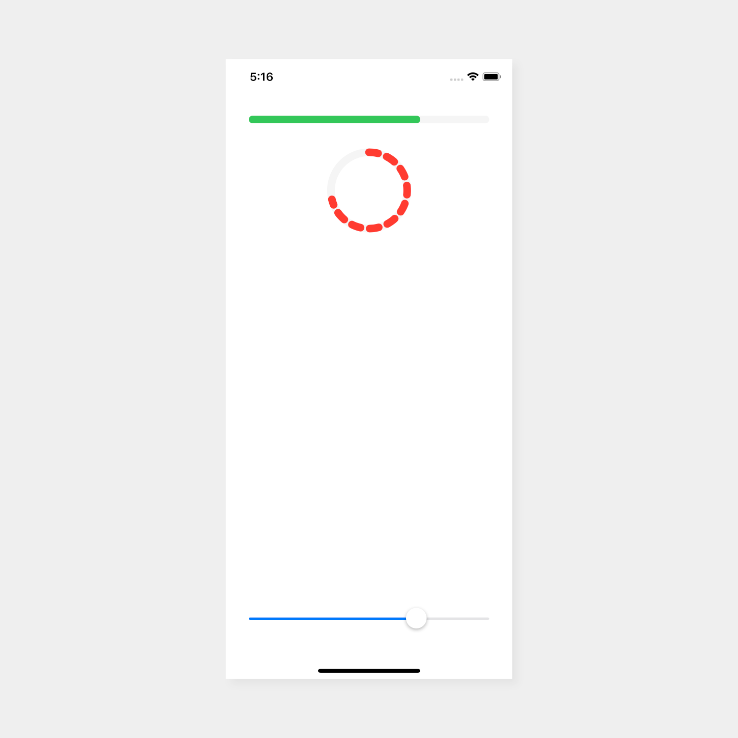
Let's update our ContentView so that we can test out the ProgressCircle. Add the following code below the ProgressBar in the ContentView:
ProgressCircle(value: $sliderValue.wrappedValue,
               maxValue: self.maxValue,
               style: .dotted,
               foregroundColor: .red,
               lineWidth: 10)
    .frame(height: 100)
If you build and run the app now, you will see the following:
Conclusion
That is it! SwiftUI makes creating a progress bar/indicator incredibly simple.
If you need to use UIActivityIndicatorView then you can take a look at this tutorial - SwiftUI Activity Indicator
If you need the full source, you can find that here.